Evolution of the SISAL corporate logo
On May 5, 1946, just a year after the end of the Second World War, the first Sisal Schedina or football pools coupon was played, marking the start of the football match prediction competition that came to be known as Totocalcio.
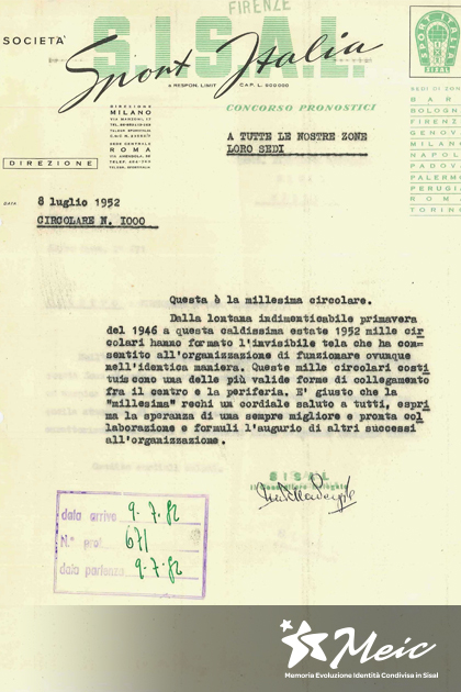
To encourage sport and rebuild Italy’s war-damaged football stadiums: this was the mission given to the Schedina and the great hope placed in it by the authorities and its creator, Massimo Della Pergola, who with Fabio Jegher and Geo Molo, also journalists, established Sisal on May 5, 1946.
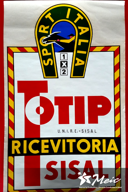
1947 - In the first logo registered in January 1947, the name SISAL (a partial acronym of Sport Italia Società A responsabilità Limitata) is set in uppercase letters and over it, in handwriting, appears Sport Italia, the official newspaper of the Schedina. Next to the logo is the pictogram of a horseshoe, symbolising good fortune, and inside it a net with a football and the three symbols Totocalcio players can use to try their luck: 1X2.
The colour green has been a distinguishing feature of Sisal right from the outset.

1948 - In May 1948, Sisal entered the world of horse racing with Totip (TOTalizzatore IPpico, or horse racing totalisator). As a result the logo was altered slightly, retaining the graphic design and changing only the symbols inside the horseshoe. The ball and net were replaced with a jockey on a galloping horse seen in profile. For half a century Sisal was represented by this logo, which brings together the world of horse racing, the newspaper Sport Italia, and the three symbols used to fill in pools coupons.

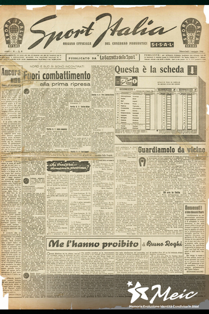
1998 - Sport Italia, the newspaper published by Sisal for over 50 years, became a house organ in the 1990s until its demise in 2006.
It was in this period that Sisal entered the world of services, invented SuperEnalotto and launched the Extrema terminal. This wind of change encouraged Sisal to bring its corporate image up to date, with the intention of forging a brand identity that expressed the concepts of decision, authority and innovative technology. The logo, with lettering set in the Univers font, was overlaid with a moustache, a distinctive sign that gave the brand a dynamic feel and was also reminiscent of the Sport Italia lettering set in italics in the previous logo.
Released from the constrictions of graphic elements from the past, the new logo represented a rational interpretation of the historical one.

2008 - Ten years later, a new identity was introduced which communicated Sisal’s desire to be not only a dynamic and intelligent brand that addresses a vast public, but also a place for meeting, relationships and entertainment. The symbolic star and intersecting shapes that suggest an embrace give the logo, which is set in a curvy font, a playful, informal and friendly look. The choice of colours is also a reference to the brand’s Italian heritage.

2013 - In 2013, there was a revision of the previous logo in line with the new corporate values, mission and vision. Sisal makes people’s lives more enjoyable by offering them a unique gaming experience.
The result is a logo with a more sober, corporate standing, accompanied by a look & feel that is dynamic, versatile and colourful, based on the concept of radiance.

Related